Written by Web Developer Jim Safley, with Web Designer Kim Nguyen
Building a web mapping application presents challenges that are well known to developers. So well known, in fact, that solutions to these challenges are constantly being developed, promoted, unused, and forgotten. Few solutions, such as Google Maps, OpenLayers, and Leaflet, survive and became de facto standards for “putting a map on a website and doing something with it.”
For most mapping needs, this is plenty. “Putting a map on a website” has never been easier. A few lines of JavaScript will turn your website into an explorable map. With a few more lines of code you can take the map and “do something with it,” like add geolocation markers and define boundaries. Of course, doing something with a map can get exponentially harder than simply adding markers, but mapping libraries provide APIs that generally solve common (and not so common) problems.
In my work with Histories of the National Mall, I encountered challenges that weren’t so typical outside a historical mapping application. For one, not all historical maps are equal. Some of the more significant maps are hand-drawn and faded and thus not good candidates for layering onto a contemporary map. Others, while bold and well-defined, lacked historical significance for the era we wanted to exemplify. Still others were so small they became pixelated and unuseable at high zoom levels. In the end we found the criteria for a good map image was a) historical significance, b) bold lines and colors, and c) extremely, extremely large.
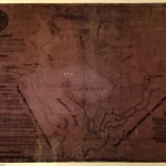
Another challenge was that old maps are geographically inaccurate or don’t follow common map projections. Since our goal was an accurate portrayal of where people, places, and things were in relation to contemporary times, I had to essentially warp old maps so they layer seamlessly onto a contemporary map. This process is called georectification and I used a fantastic web service called Map Warper, which, by the way, hosts thousands of interesting historical maps, so check it out.
To tile the historical map images I used MapTiler. Tiling is the process of copying an image into different sizes (respective to zoom levels) and cutting them into a grid of squares called tiles. This way the browser only has to load the parts of the image that is currently showing, not the entire image, which can be massive and load very slowly. The tiling process takes quite a bit of time given that it generates hundreds of derivative images for one image. I tried MapTiler, because it is free and I could easily use it on my operating system.
To bring all this together I used Leaflet, a relatively new open source JavaScript mapping library. Its small footprint and use of newer technologies (HTML5 and CSS3) makes it a popular choice for mobile mapping applications. I actually chose Leaflet at a party attended by leading members of the geospatial activist community. Attendees recommended a shiny new tool for mapping written by a friend of theirs. Now, Leaflet has grown into a go-to solution for many web mapping projects.
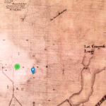
Integrating the application into Histories of the National Mall was as simple as writing a plugin for Omeka (MallMap) that renders an interactive map, accepts user input, queries the database, and returns a GeoJSON document containing geolocated people, places, and events. With some finessing, Leaflet does the rest by stitching together the historical map tiles and placing markers on the map that users can click or touch for more information. Given the tremendous number of items and features on the page at any given time, I used a Leaflet plugin that clustered markers in a useable way.
Our feature database is made up of Omeka items that have been geolocated using Omeka’s Geolocation plugin. When the content team creates an item, they tag its location on the plugin’s map. Once making the item public, it automatically becomes visible to the MallMap plugin. This workflow made it possible to serve a functional map while we built the digital collections. Even now, after release, we continue to add features with no undue intervention from the content team.
A primary objective for the project was to provide visitors to the National Mall a mobile tool to explore the space around them. Thankfully, Leaflet implements the Geolocation API which hooks into a client device’s GPS. When the application detects that a user is physically within the boundaries of downtown Washington, DC, it pans and zooms to the location and places a star, representing the user’s location, on the map among the historical markers. The marker follows the user in real-time, providing spatial context to what they learn about on screen.
Of course, a good user experience goes beyond a functional application. Kim Nguyen, our web designer, worked hard to build an attractive design and a usable interface. In her own words:
A lot of the mobile presentation felt straightforward due to the small space—things like place or event descriptions were easy to reduce to a single column layout. The challenges were in orienting the users in how we want them to use the map. In my view, there are two ways to explore DC’s sights with our interface: the first is to use Leaflet’s features and geolocation to explore items in the immediate area, and the second is to use the map filters to get a better sense of historical contexts.
The first goal was pretty easy, as users have become accustomed to using map interfaces, they know the basic functionality and symbols for panning and zooming. Identifying the map filters was trickier, because we ask users to do something they are less familiar with doing on a map. To ensure that users knew about the map filters, they see a short orientation message during the first visit to the map–the “call to action.” Once a user clicks to open the filters menu, I wanted users to be able to learn by doing. Every time someone selects an option from the filter’s dropdown menus, the map updates in the background. I made the background of the filters menu slightly transparent so that the text would be legible, while letting the user see that something had changed with their action. It’s a simple interaction, but I think it goes a long way to making the map feel toy-like. A user should have fun playing with and exploring the map. Experimenting with an interface and getting immediate feedback is a playful activity, and I think facilitating that goes a long way into hooking the user.
Together, Kim and I, along with the content and testing teams, produced a fun, interactive window into the histories of the National Mall using modern mapping technologies and leveraging the ubiquity of mobile devices. In effect, we put a map on a website and are letting our audience do something with it.