Testing the Explorations reinforced the need for the content team to write in small, concise chunks, readable on small screens. Our approach drew heavily from museum exhibit label writing practices, and the team’s personal experiences with mobile history sites that overwhelmed users with too much text.
To make reading the content of Histories easier on a mobile device, and to ensure consistency, the content team created a style guide. The goal was to make the best use of words. We set a 100-word maximum for item descriptions and Exploration answers. We worked to eliminate esoteric and academic vocabulary, and to write in plain, descriptive prose. We used numerals when discussing numbers, and we wrote 1900s, rather than 20th Century, to eliminate user confusion over what years actually comprised specific centuries. Writing in concise and descriptive language was a big challenge for the entire team and demanded a multi-step revision process.
Every piece of content on the site was reviewed by at least three team members. After researching and working through a first draft of text in an external text editor, a team member built out an item in the Omeka admin of Histories, keeping the item private. Then another team member reviewed the item. Reviewing an item involved checking that all required fields were filled and interpreted appropriately, and that the information was accurate and relevant to the history of the National Mall. Then, the same item was reviewed for spelling, grammar, style consistency, and clarity of the language. The editor and item creator worked together to revise the item until they felt it was ready for a final review. Then, the Project Manager or a Director reviewed the item, and either pushed it back to the creator for revision, or published the item.

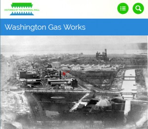
Selecting images to accompany an item that were appropriate for viewing on a small screen presented a research challenge. Images had to be readable on a phone. Some digitized photographs from the nineteenth century represented an event or place, but the perspective or composition was too difficult to decipher on a phone. When faced with few visual options, the content team annotated a digital image with an arrow to draw the user’s eye to the area representing that item.
Explorations were longer and required writing in a shared space to allow for collaboration, discussion, and revision. The team drafted primarily in Google Docs, starting with a question and possible primary source answers. As with item creation, one content team member took the lead on researching and drafting an Exploration, and then asked one other peer to collaborate. One of the Directors reviewed the final draft in Google docs, and then the Exploration’s lead built the short exhibit in Omeka. If the primary sources had not already been added as items to the website, new items had to be created, and followed the process stated above. Composing a complete Exploration required many weeks, in some cases months, of research, writing, revising, and editing.