Content development and the web development processes occurred simultaneously.

In the early weeks of the project, the content team researched the Mall’s history and mapped out different ways of organizing and presenting the content in the Omeka site. We understood that users would approach and interact with the site differently based on the options available and their needs. Some would seek the answer to a quick question, while others would want guided paths to help them explore the Mall’s histories. To think through our options, we sketched out possible user paths and page content on whiteboards at the RRCHNM. We started with the design mock-ups created for the grant proposal, and modified from there.
Beginning with the homepage, we identified major entry points to the content sections. Next, we outlined the pages where a user landed when clicking on one of those entry points. Using arrows, we created pathways.
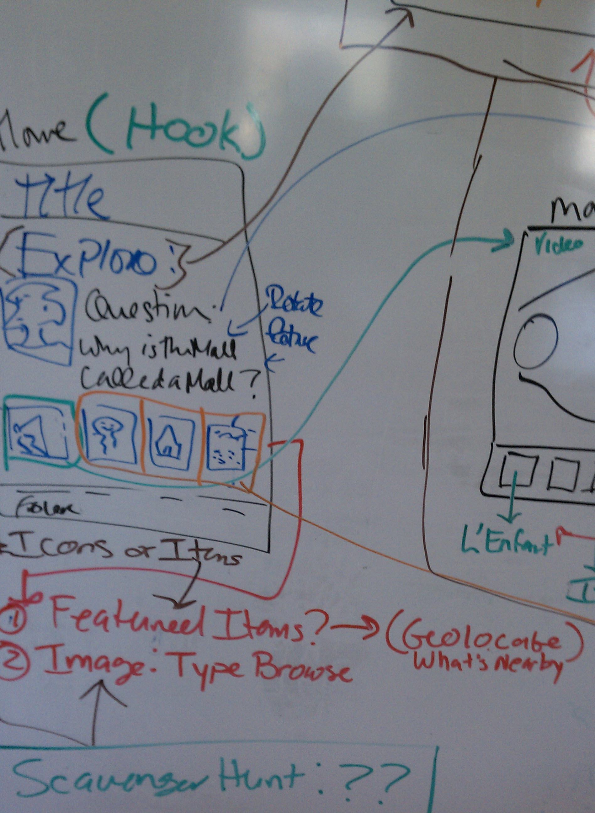
Drafting on whiteboards helped the team make decisions about the site’s content structure before building any part of the website.
Next, we prototyped the site on paper, and sketched out where content would be placed on the homepage and on specific pages. With those in-hand we tested our assumptions about user behavior with our potential audiences.